→
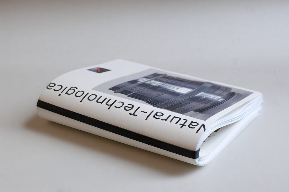
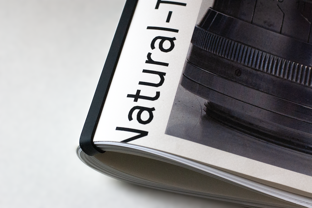
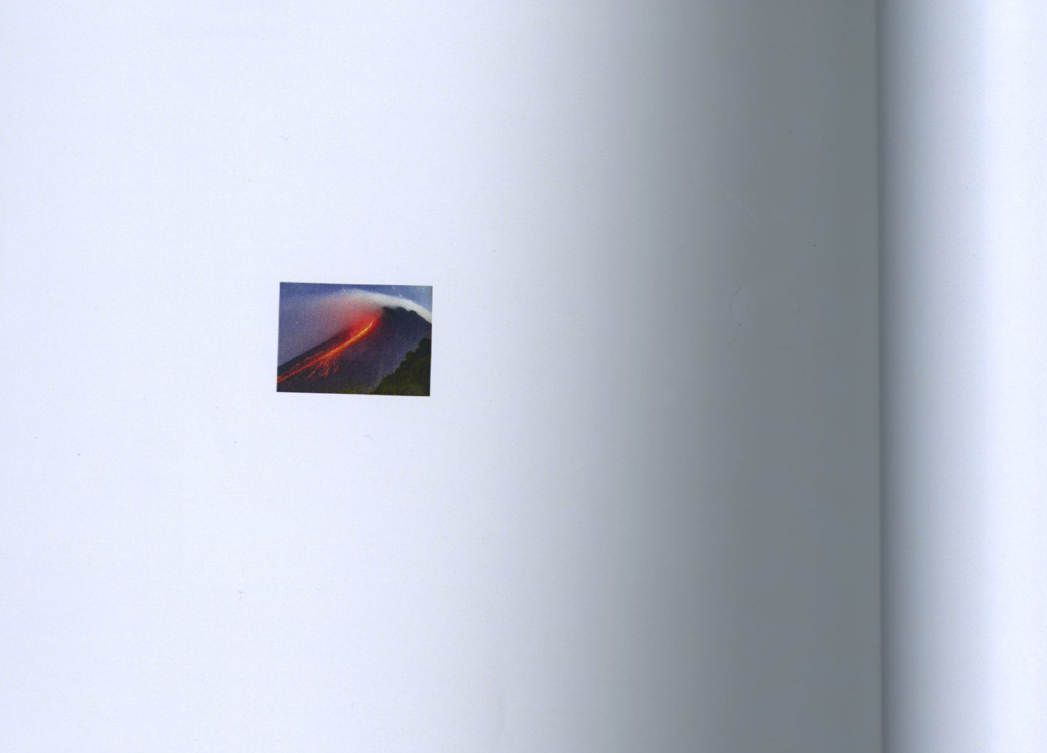
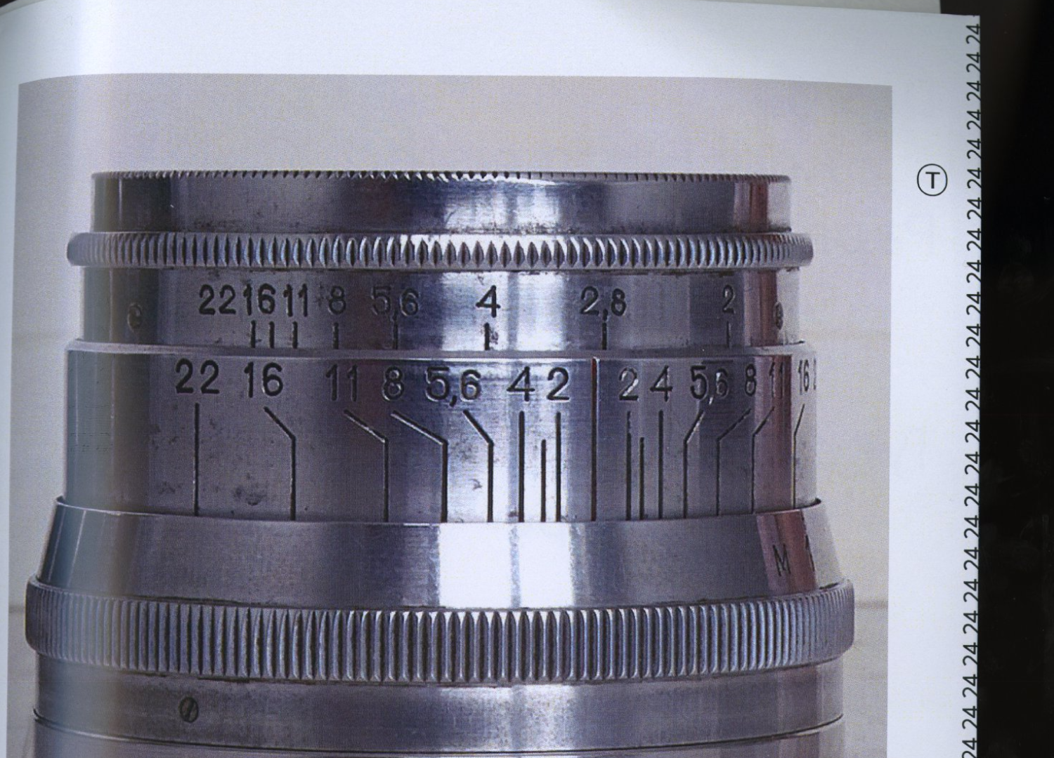
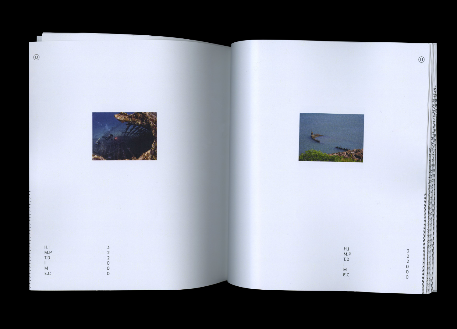
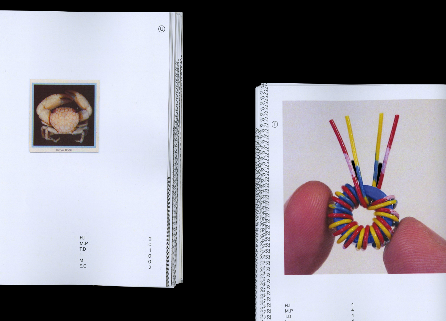
Natural–Technological, 2026
Publication Design
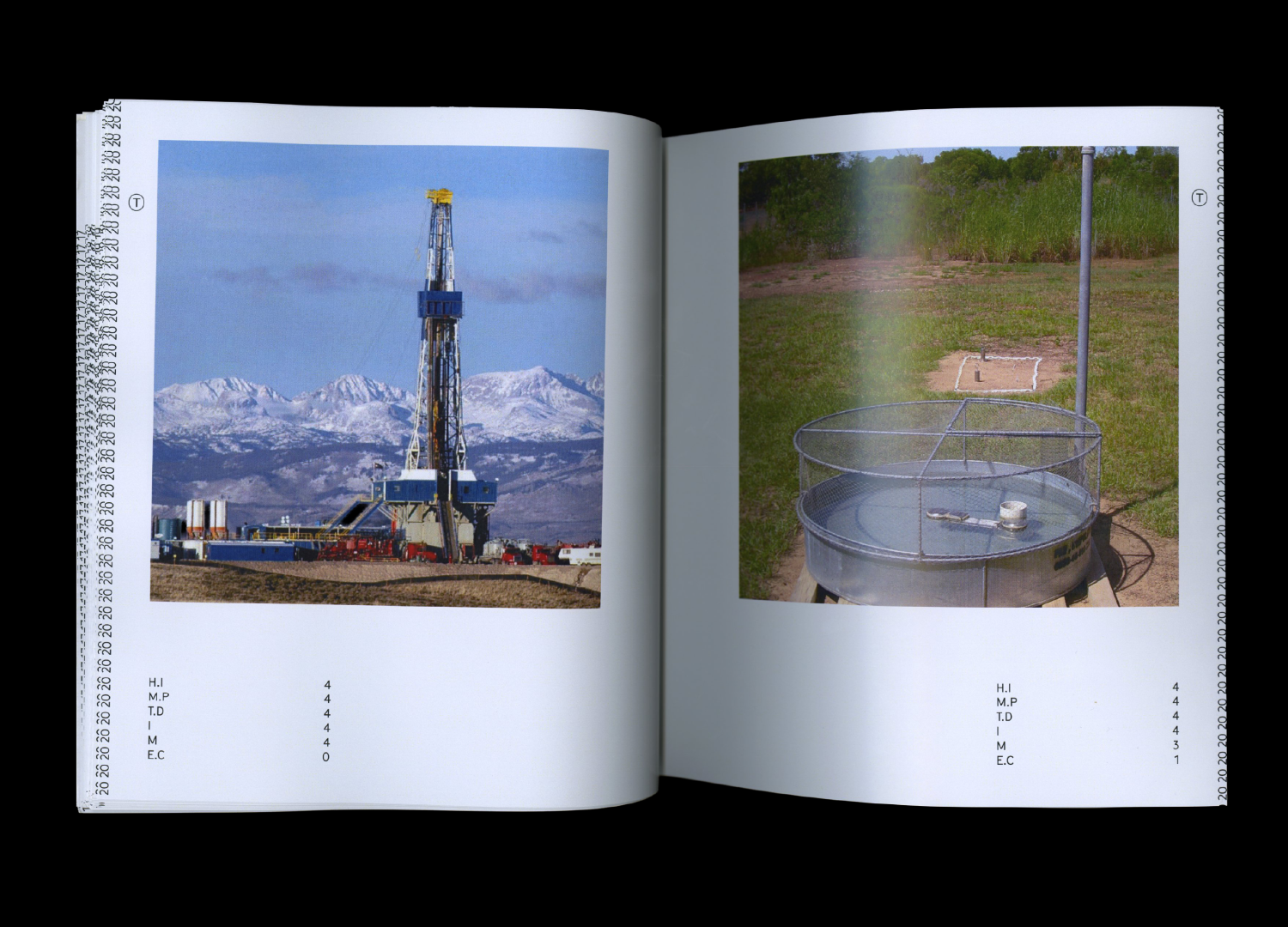
Natural–Technological places 256 images on a spectrum from the most organic to the most artificial. Each image is evaluated across five categories: Human Intervention, Material Process, Technological Development, Intentionality, and Environmental Control. Each category is rated on a scale of 0–4, with the combined score determining where the image falls within five classifications: Natural, Unrefined, Hybrid, Refined, or Technological.
→
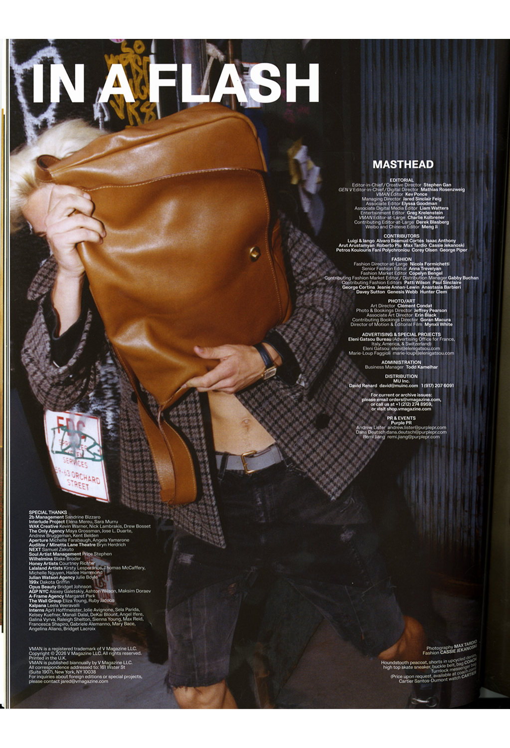
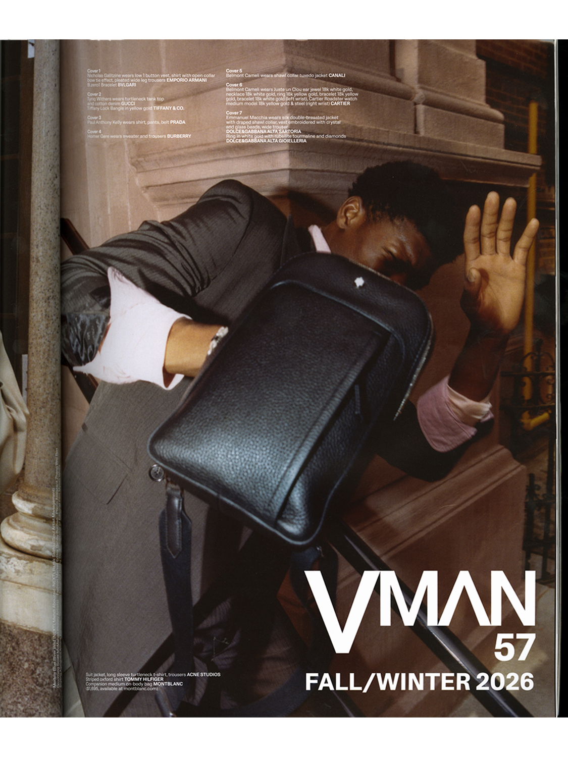
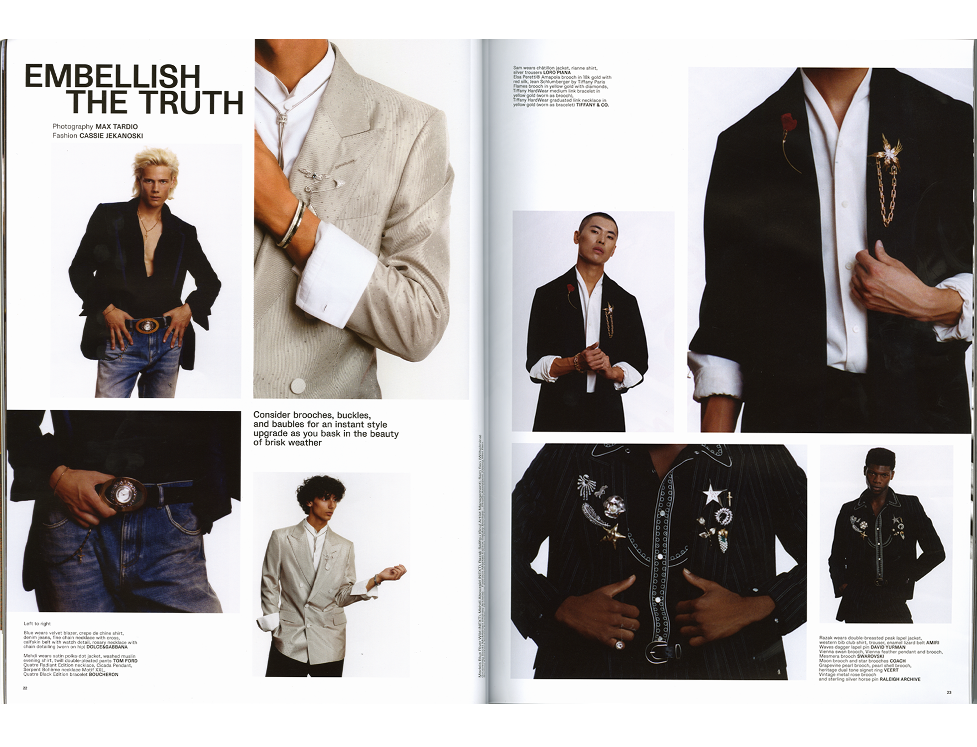
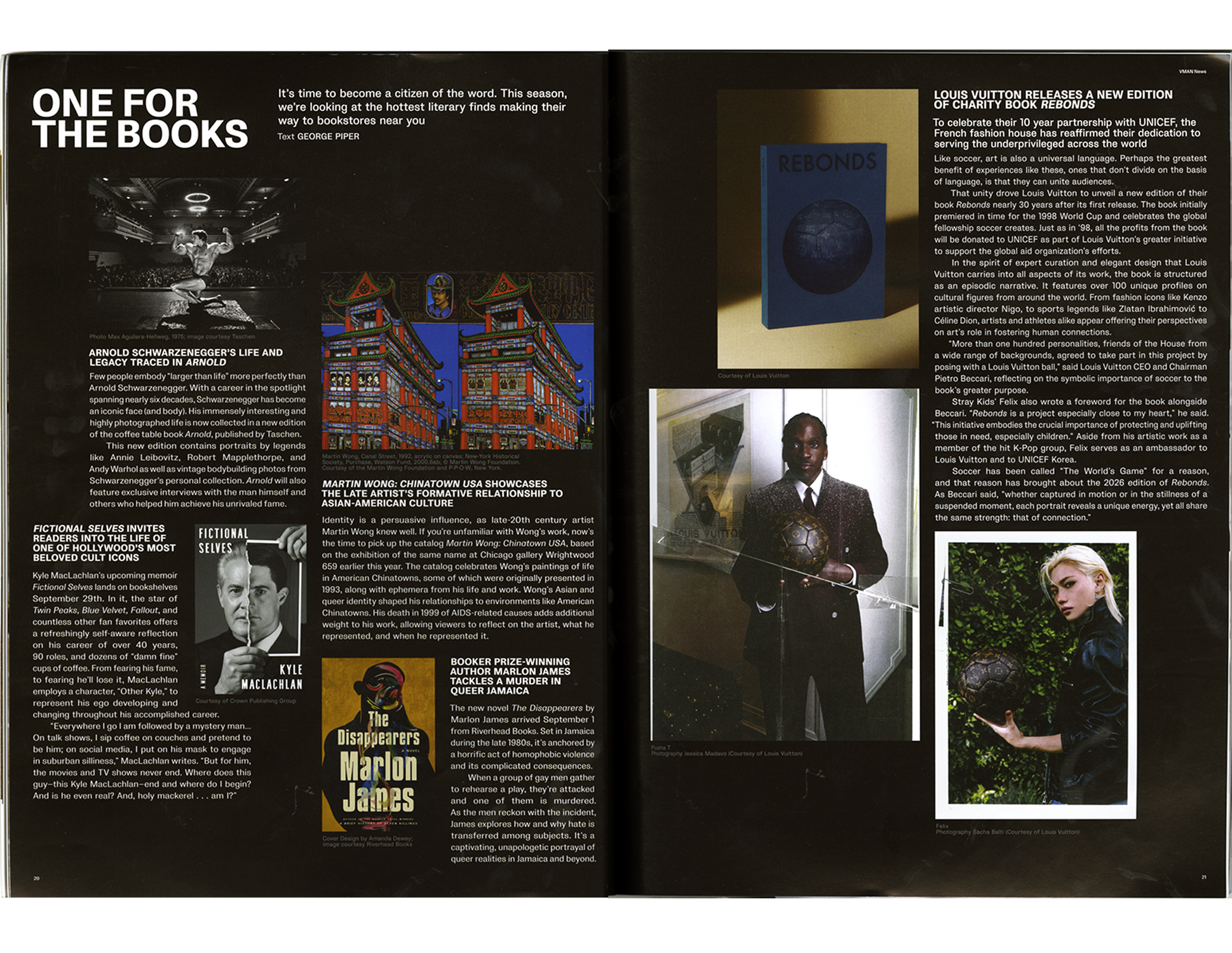
VMAN 57, 2026
Layout Design & Art Direction Support
Art Director: Clément Condat
Associate Art Director: Erin Black
→
STORM II, 2026
Motion Graphics
Music lyric video developed in after effects for STORM II, by Yung Lean and GENER8TION. Watch Full Video
→
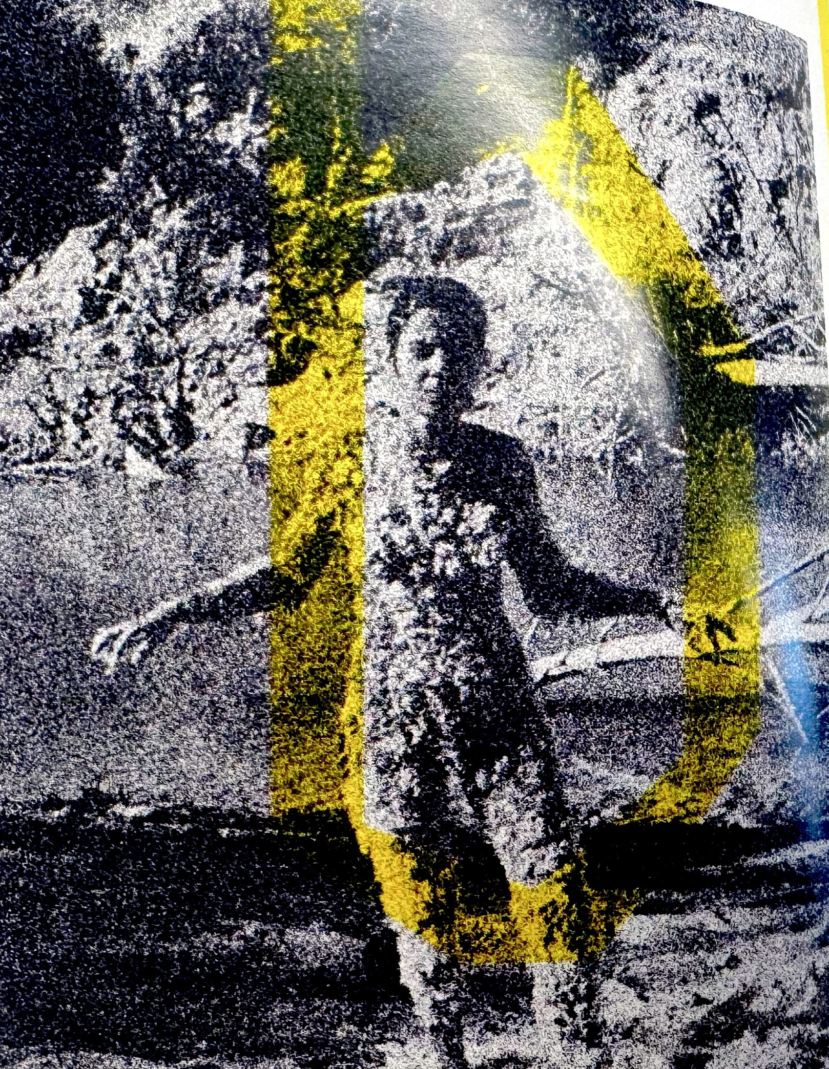
Takete, 2025
Typeface Design
Typespecimen designed for takete, a WIP sans/sans serif typeface made in Glyphs. Using Ana Mendieta's art & words.
Return To Library, 2026
Web Design, Web Development
In collaboration with Temperance Downing, I designed and developed the website for Return To Library, an emerging publishing collective.
Visit Website
→
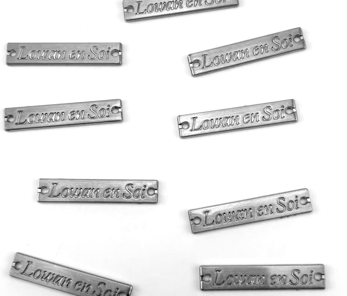
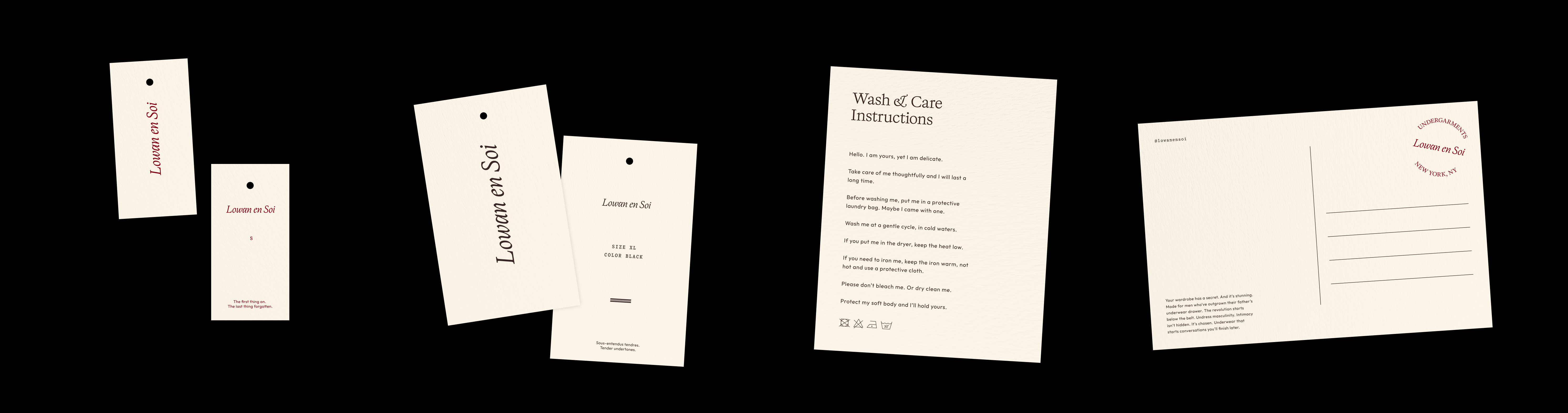
Lowan En Soi, 2026
Design
Building on Forrest Huu Ta's brand identity, I developed print assets for Lowan En Soi, a male lingerie brand. Working closely with Lowan, I expanded the visual identity through a custom logo and packaging design, creating a cohesive system across the brand’s physical touchpoints.
→
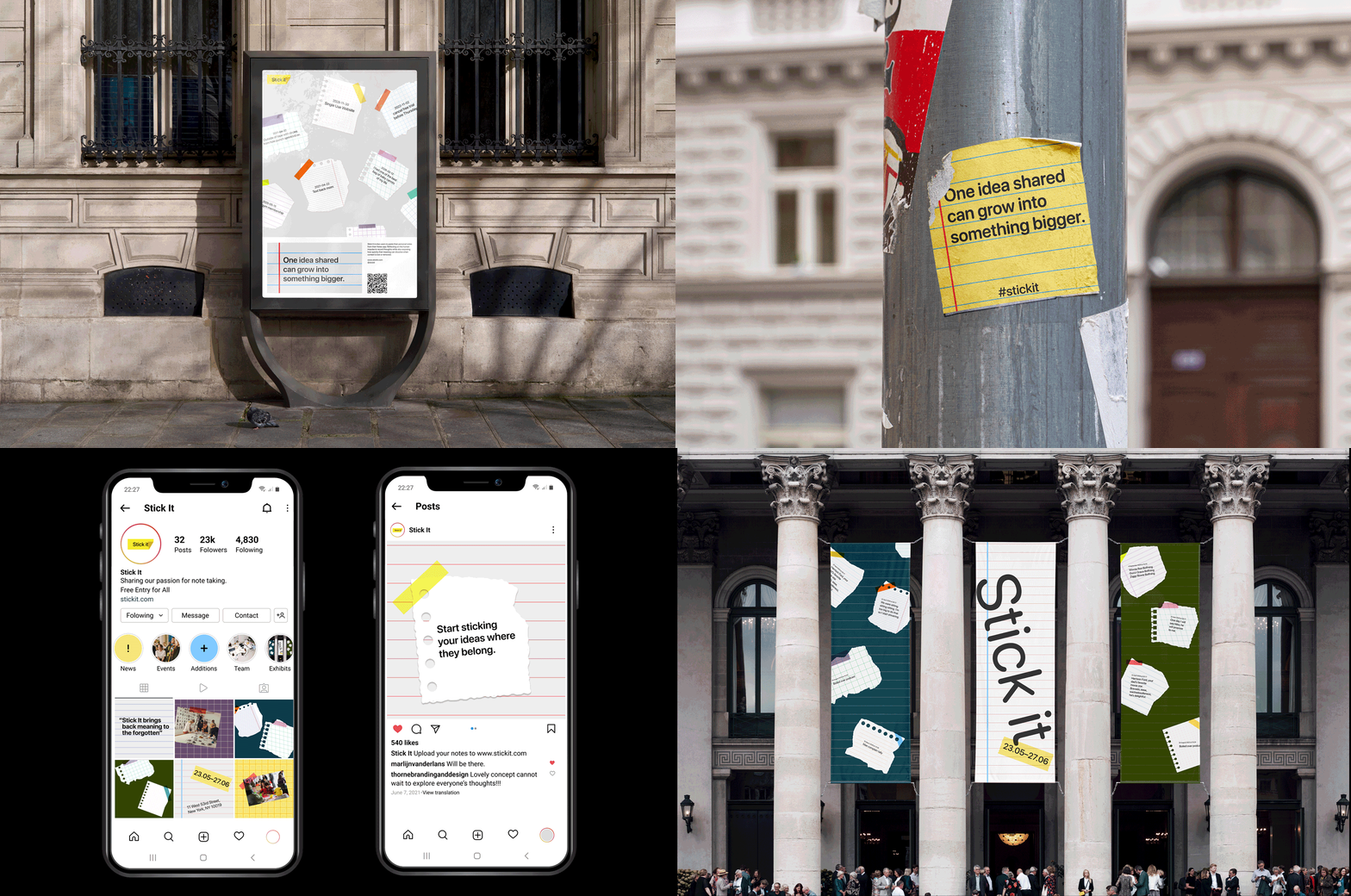
Stick It, 2026
Brand Identity, Web Design, Creative Coding
Stick It invites users to paste their personal notes from the Notes app. Reflecting on the human impulse to record thoughts while also exposing how quickly that meaning can dissolve when context is lost or removed.
Visit Website
→
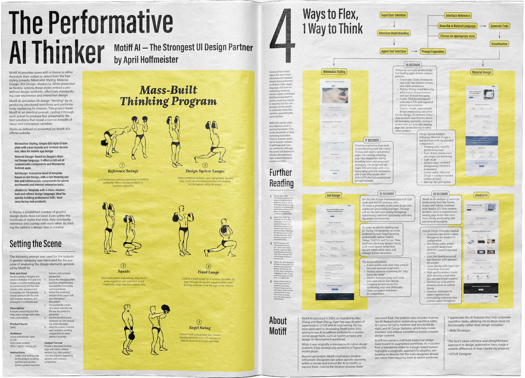
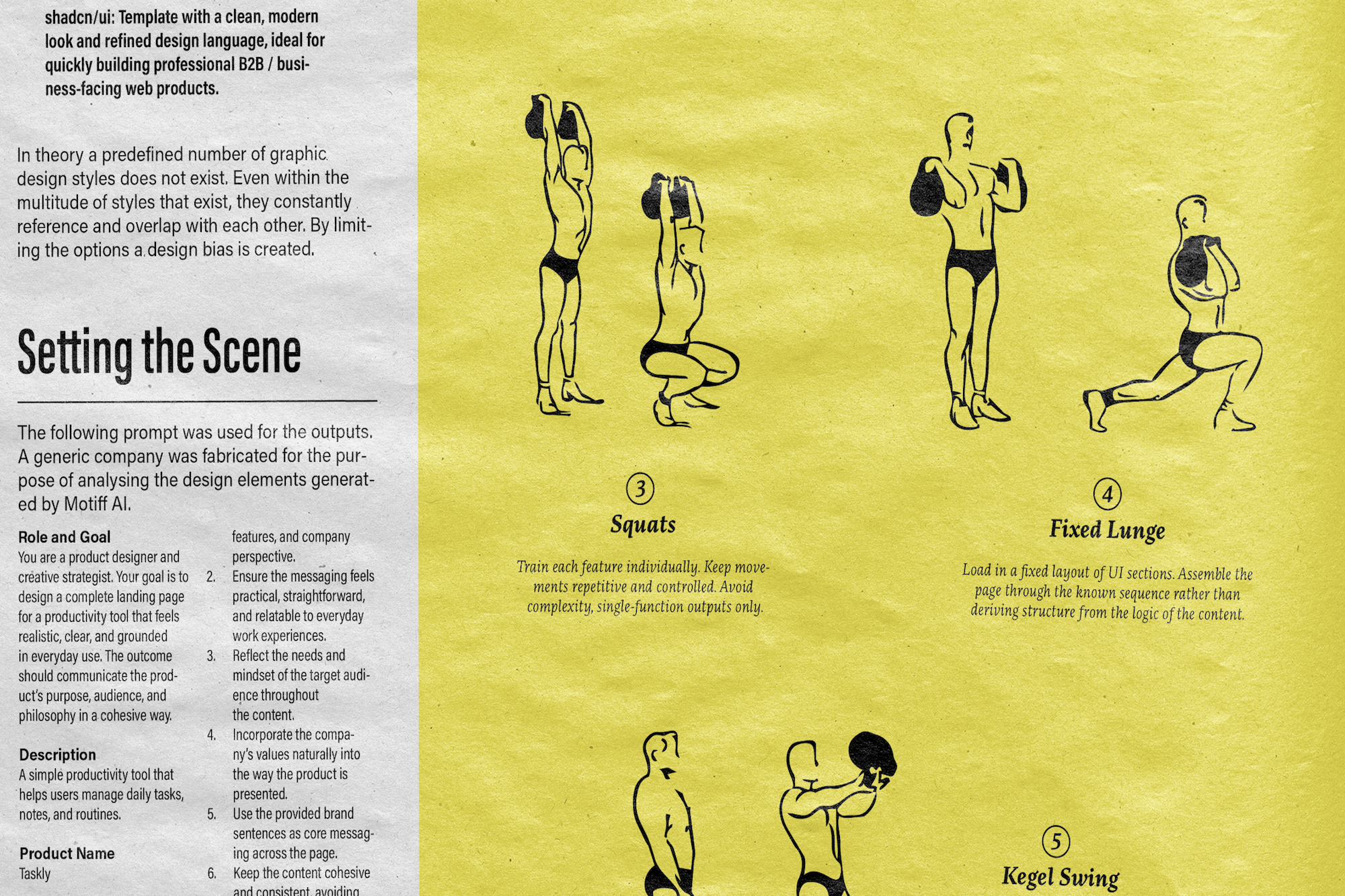
Motiff AI, 2026
Layout Design, Creative Direction
As part of a larger publication, The Performative AI Thinker is featured as a spread, exploring the use of Motiff AI in UI/UX design.
→
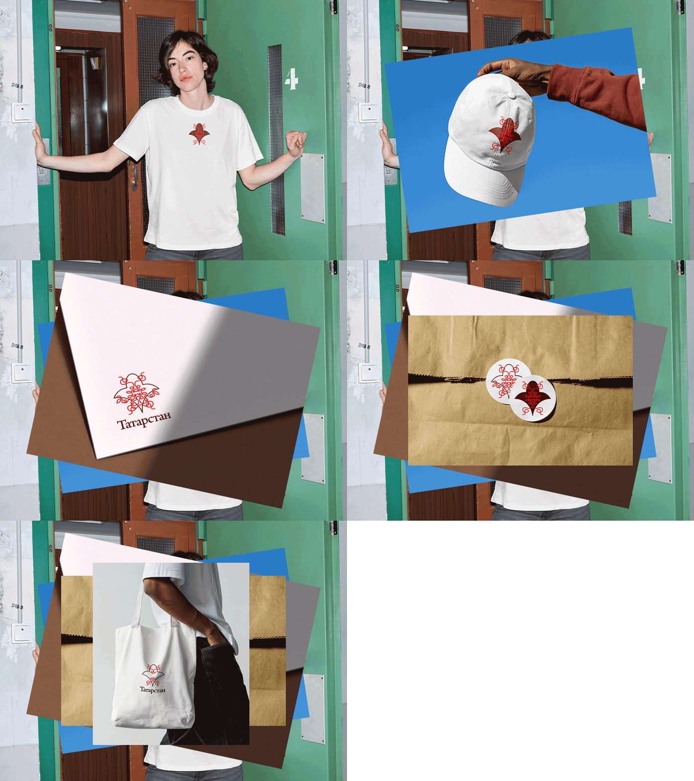
Lale, 2026
Logo Design, Creative Coding
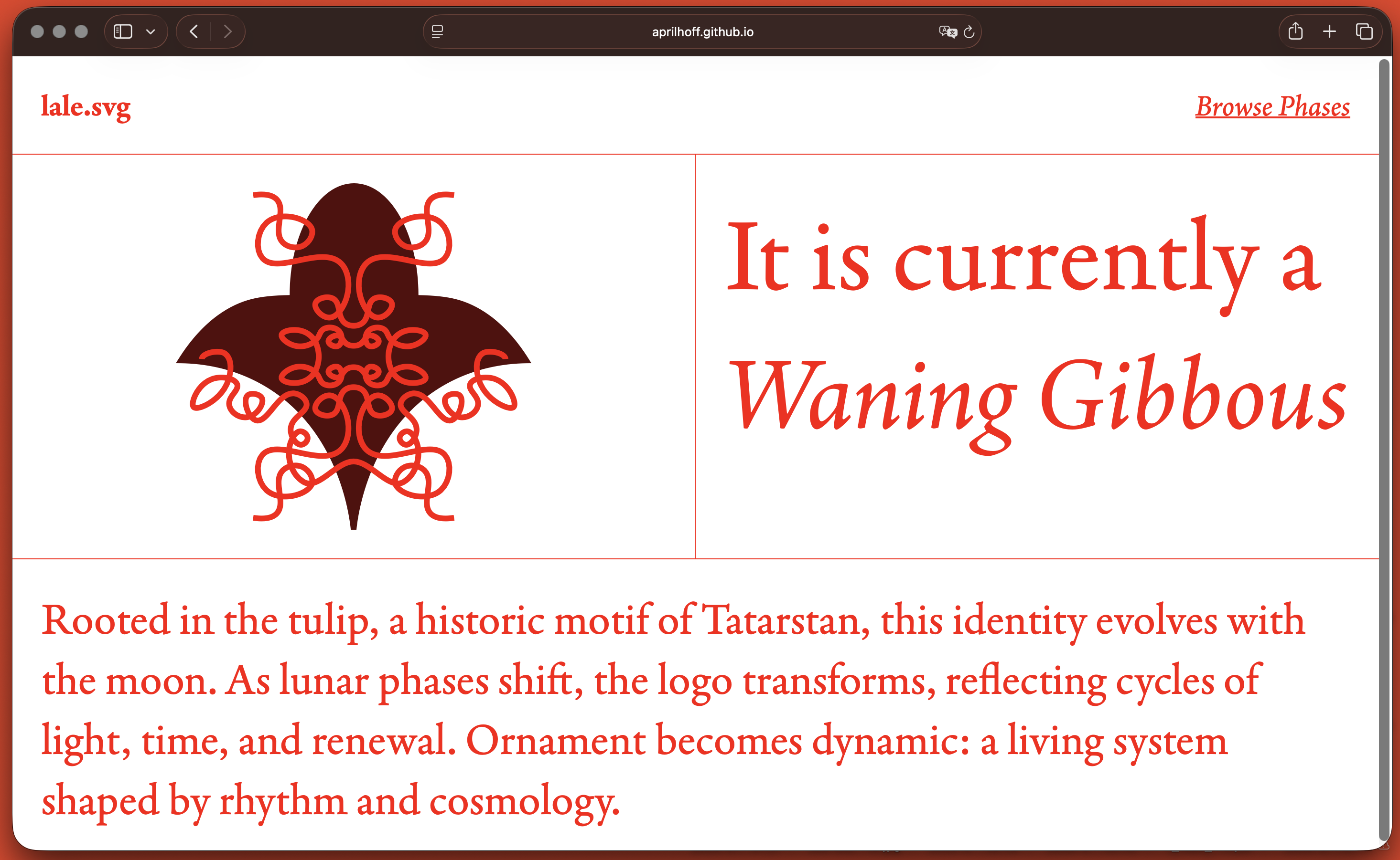
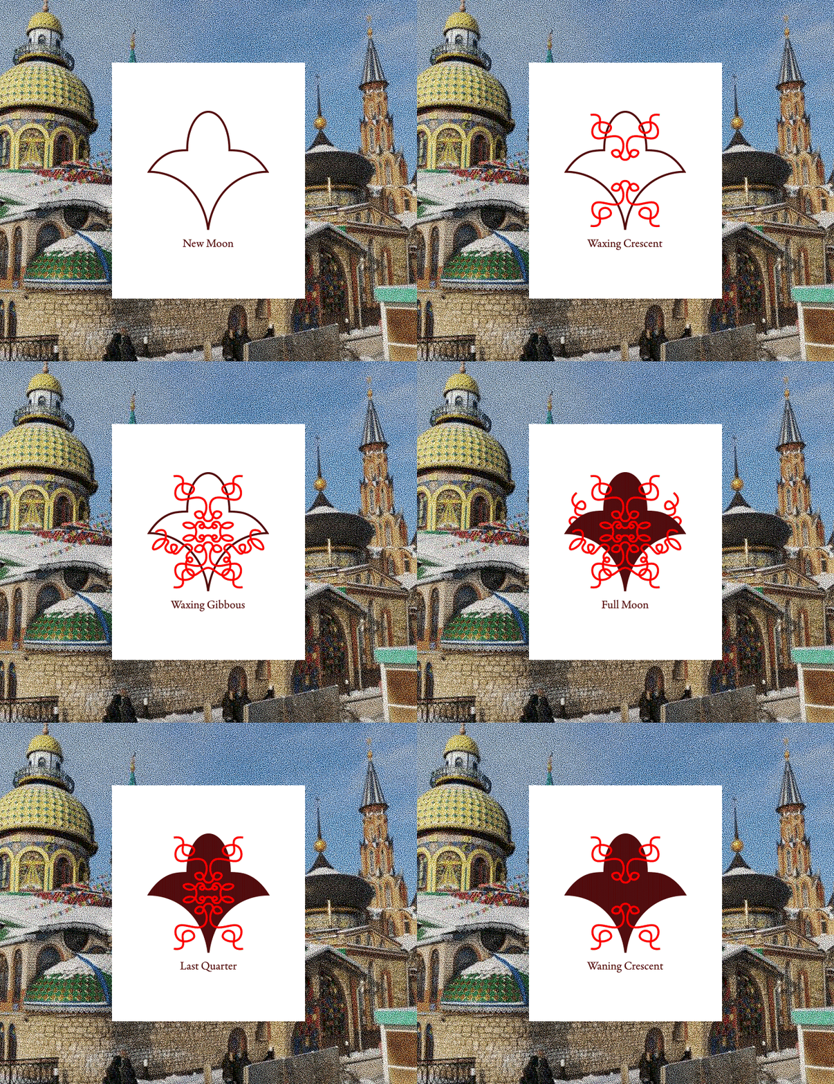
Using a real-time API to retrieve the current lunar phase in Tatarstan, I designed a dynamic logo system that evolves in sync with the moon’s cycle.
Visit Website
→
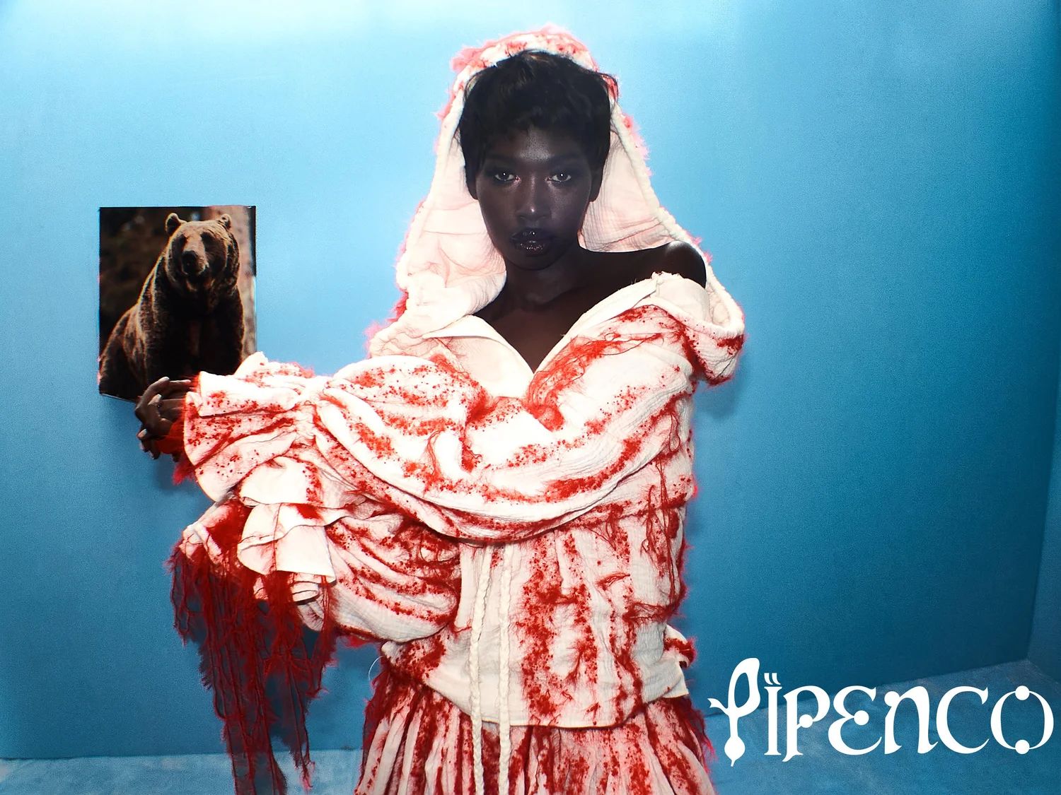
Pipenco, 2025
Poster Design
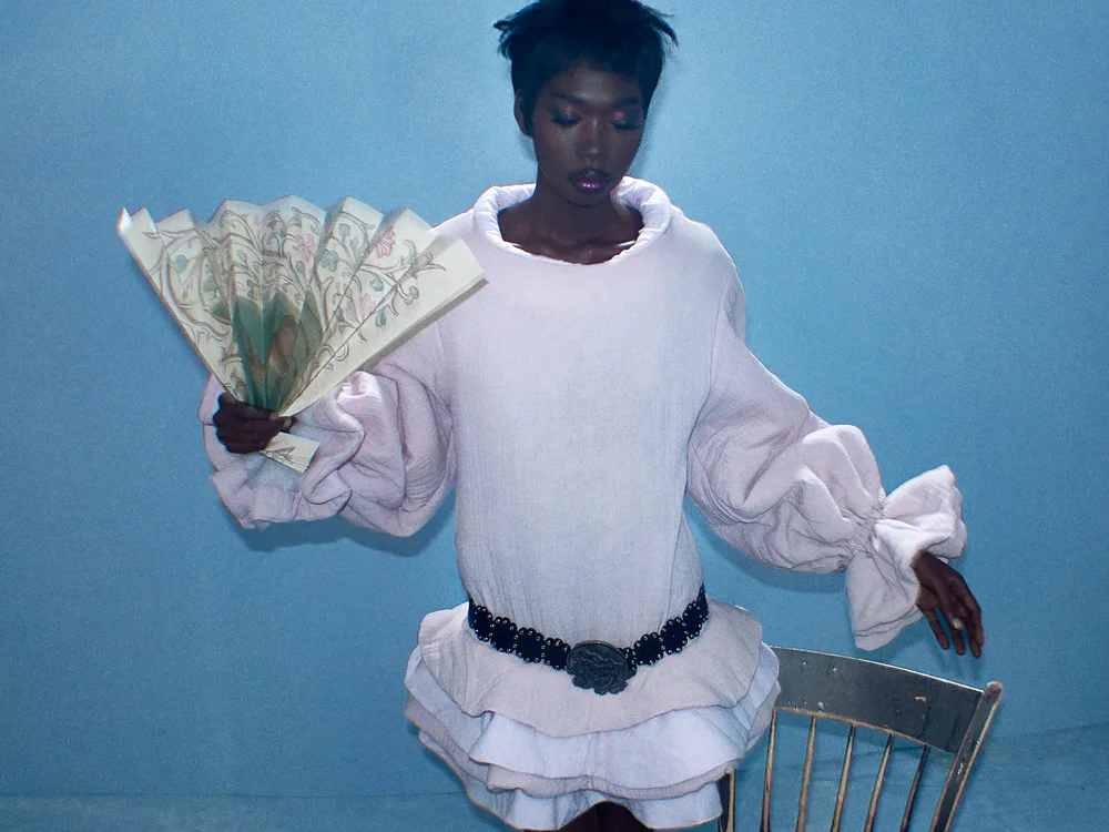
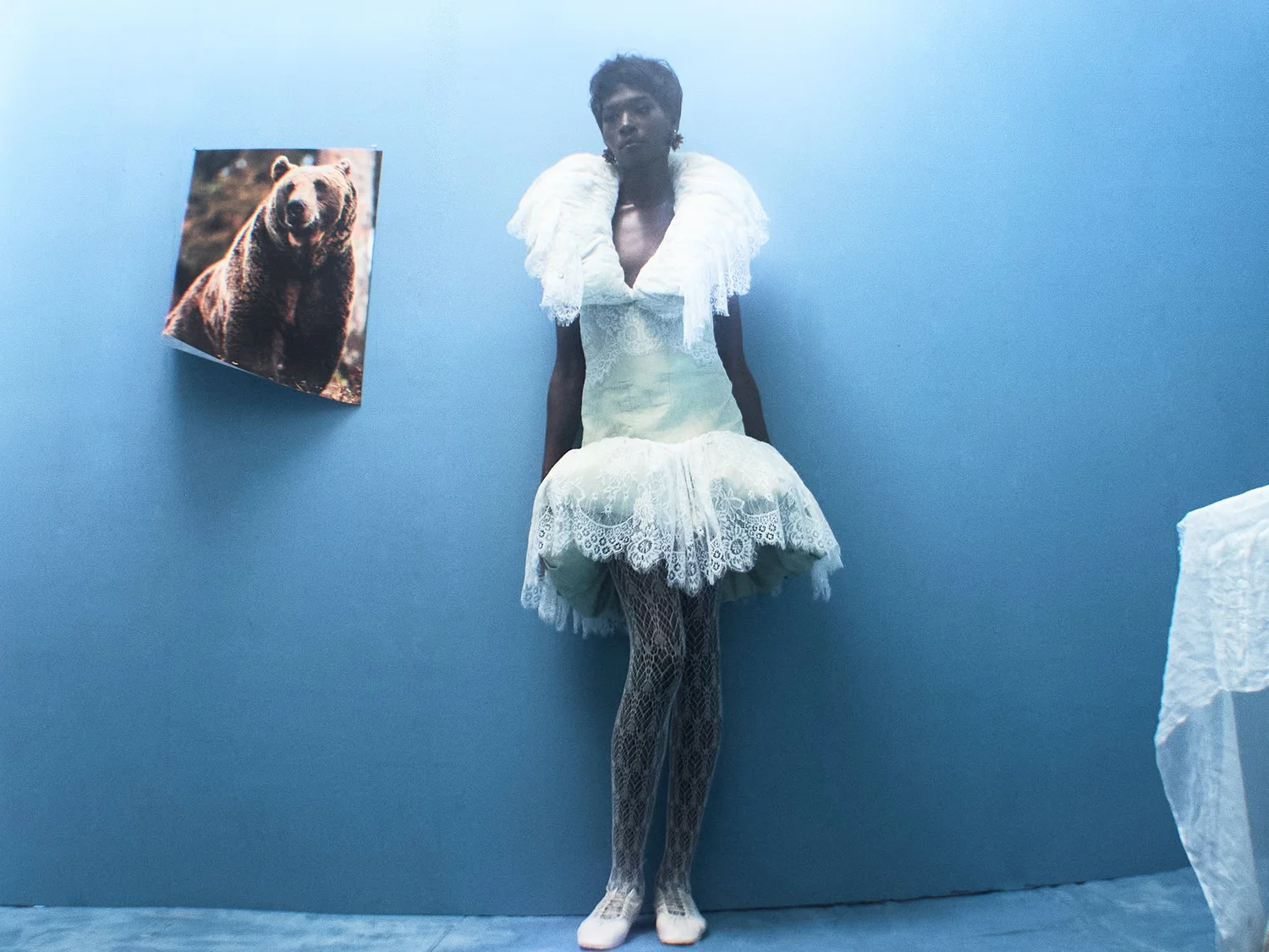
AI assisted posters generated for Pipenco's SS26 campaign shoot. Creative Direction by Pipenco's Team.
W Magazine Article
Pipenco SS26
Virtual Twins, 2026
Data Visualisation, Creative Coding
Virtual Twins sorts wikipedia's expansive database on individuals “who were born and died on the same day.” The dataset has been sorted so that uncanny similarities between these individuals can be easily explored. By transforming raw information into an exploratory visual environment, the project makes patterns of coincidence and historical overlap more intuitive and engaging to understand.
Visit Website
→
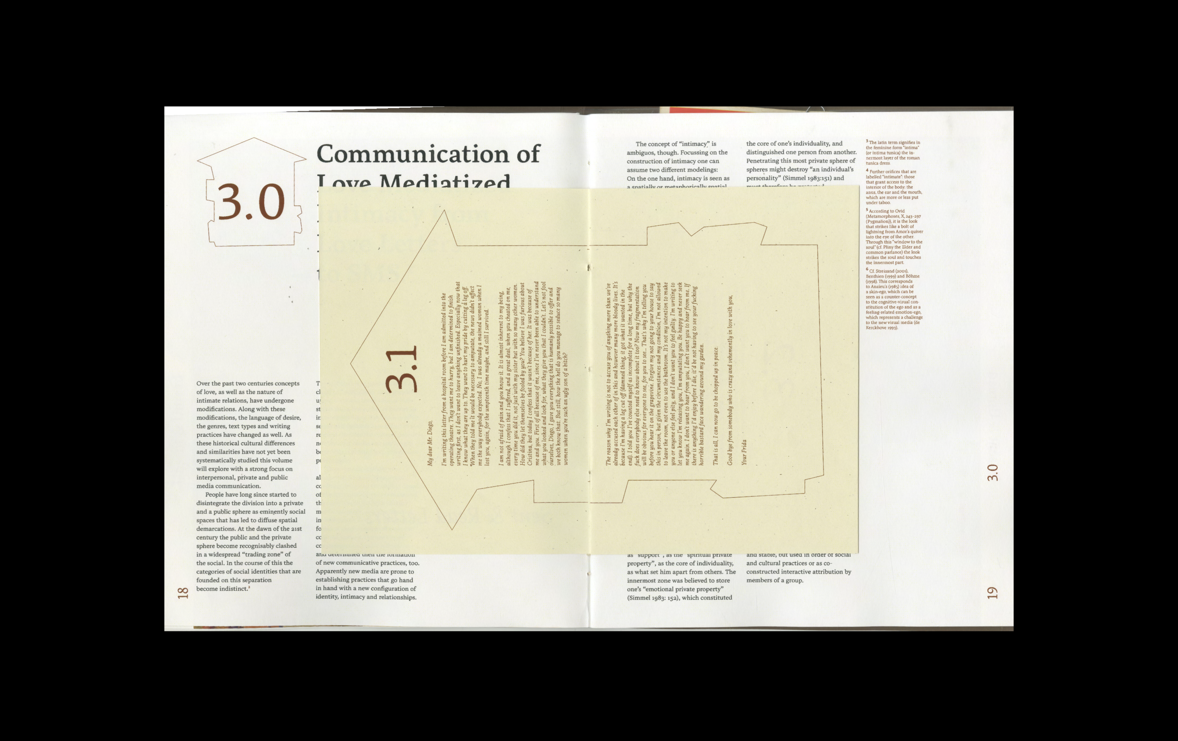
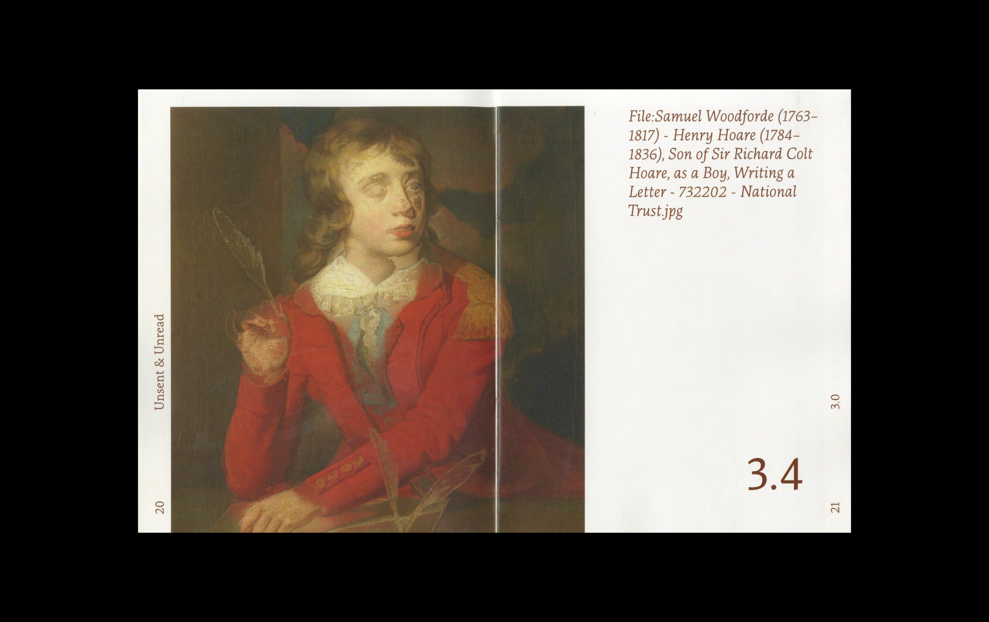
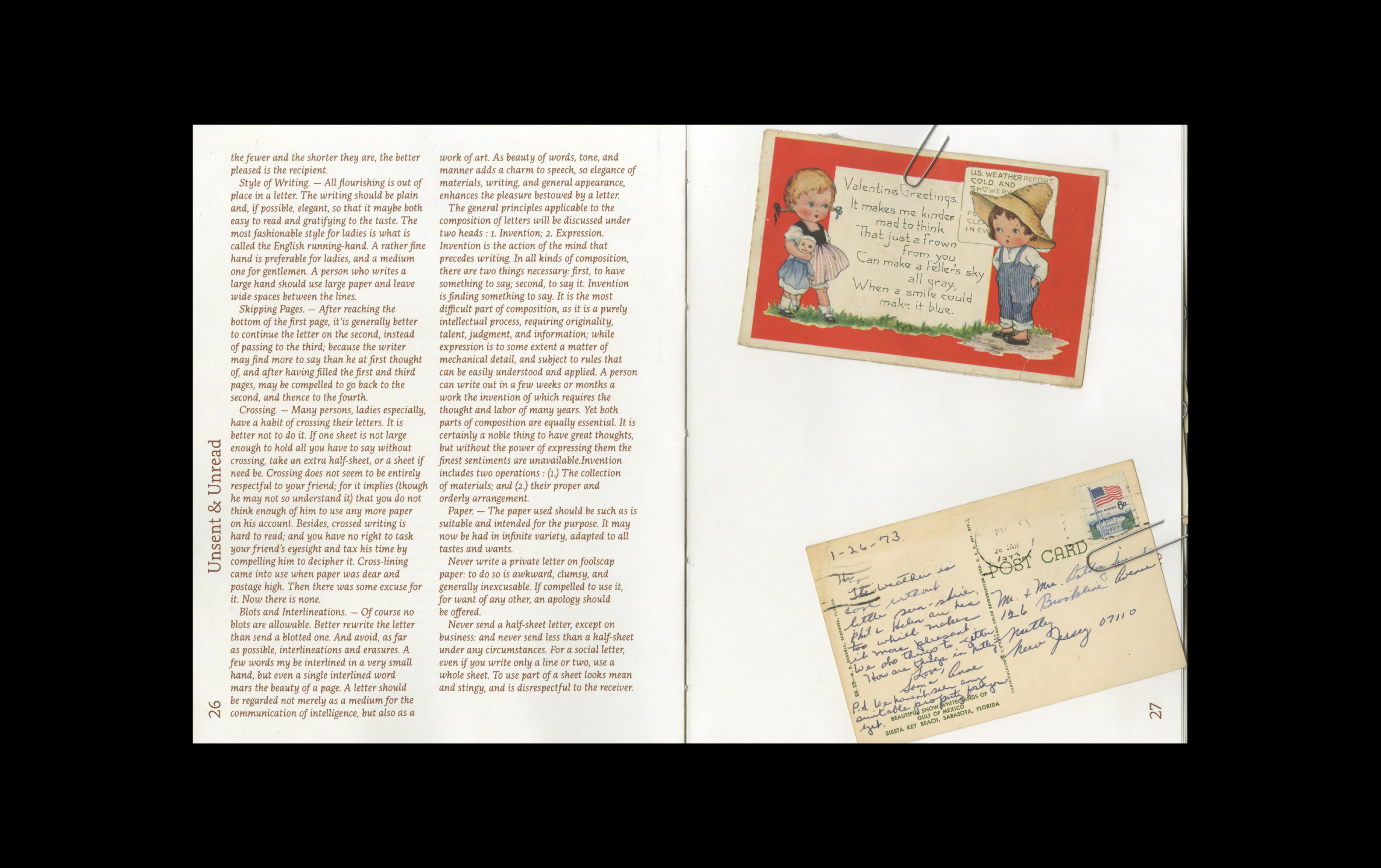
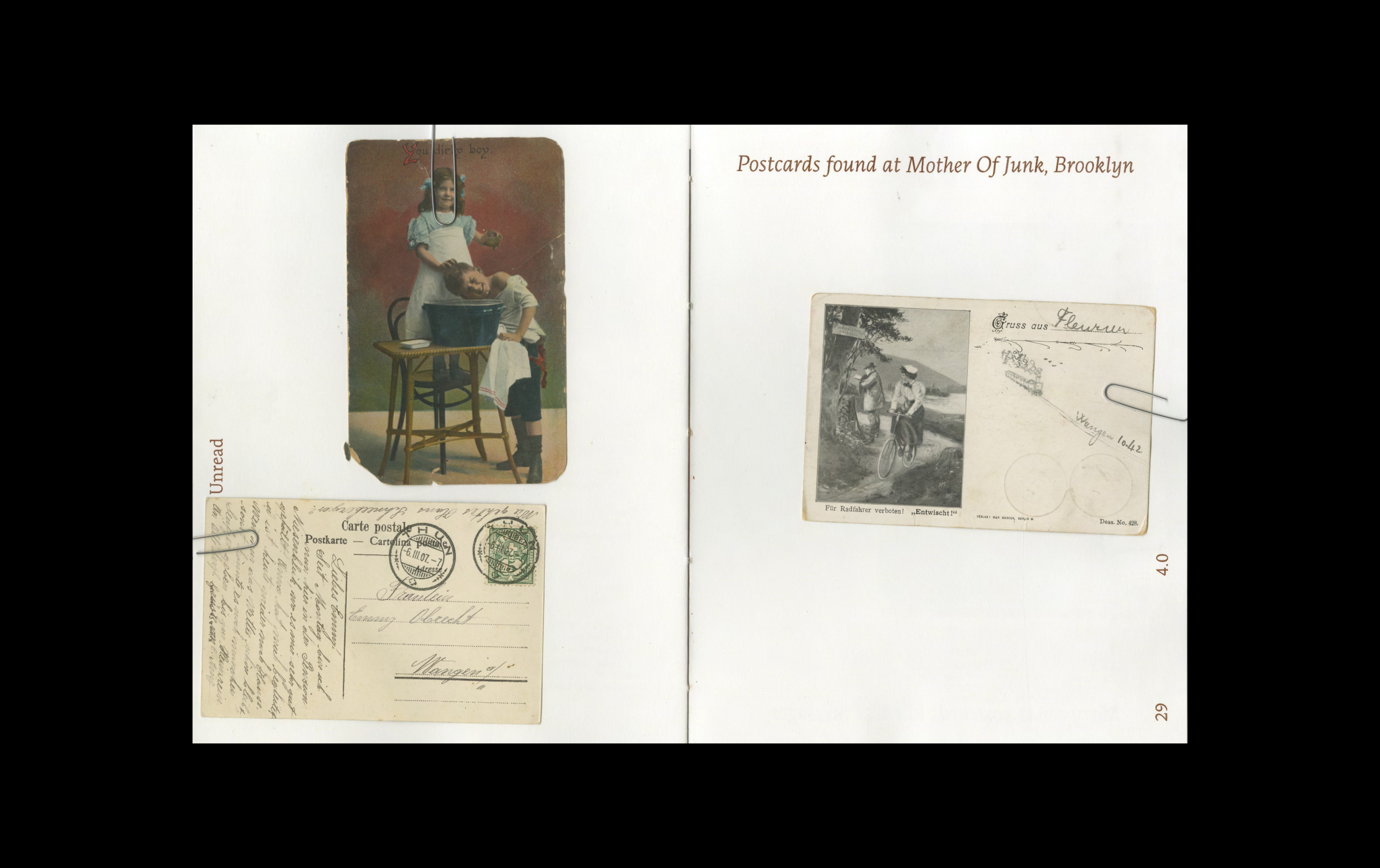
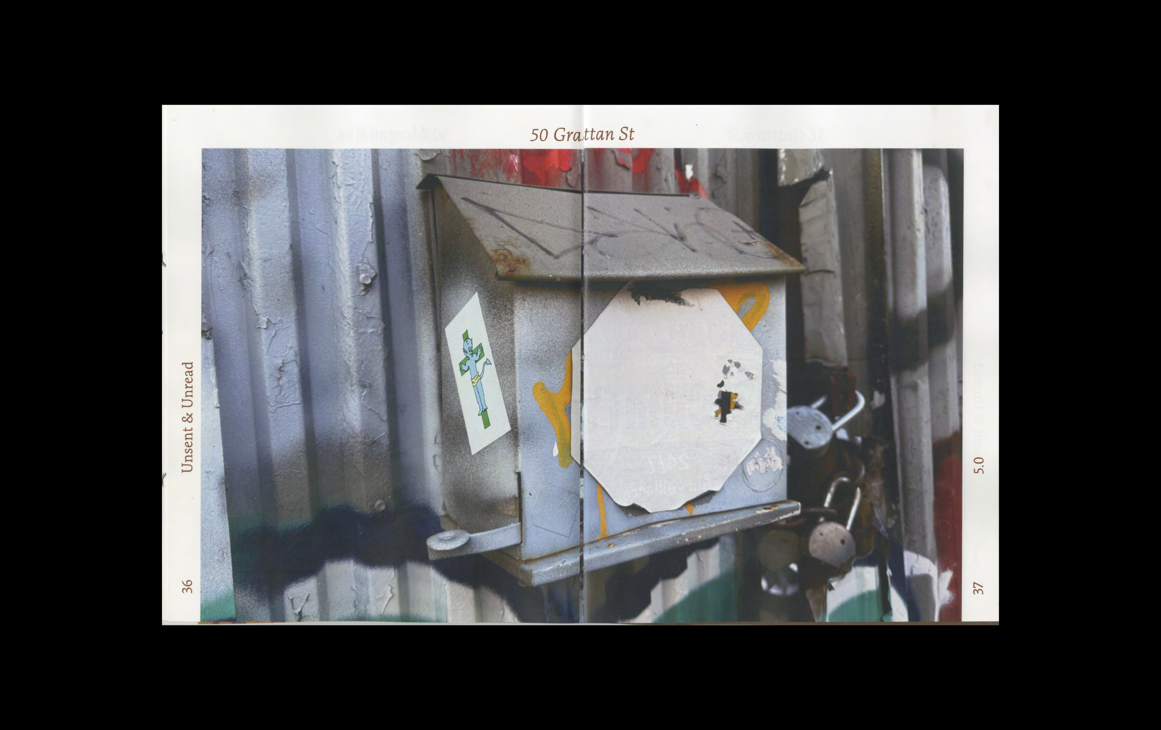
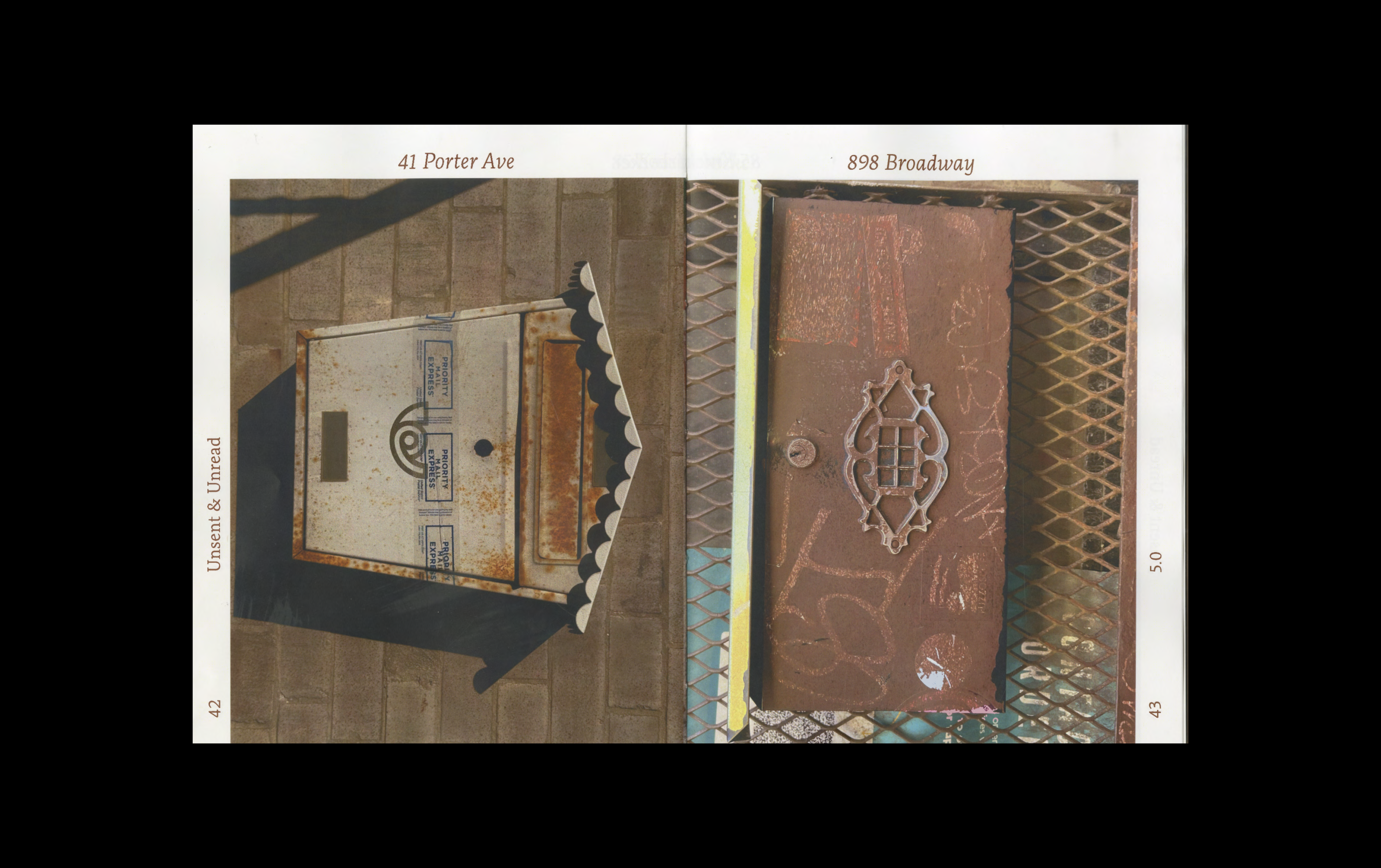
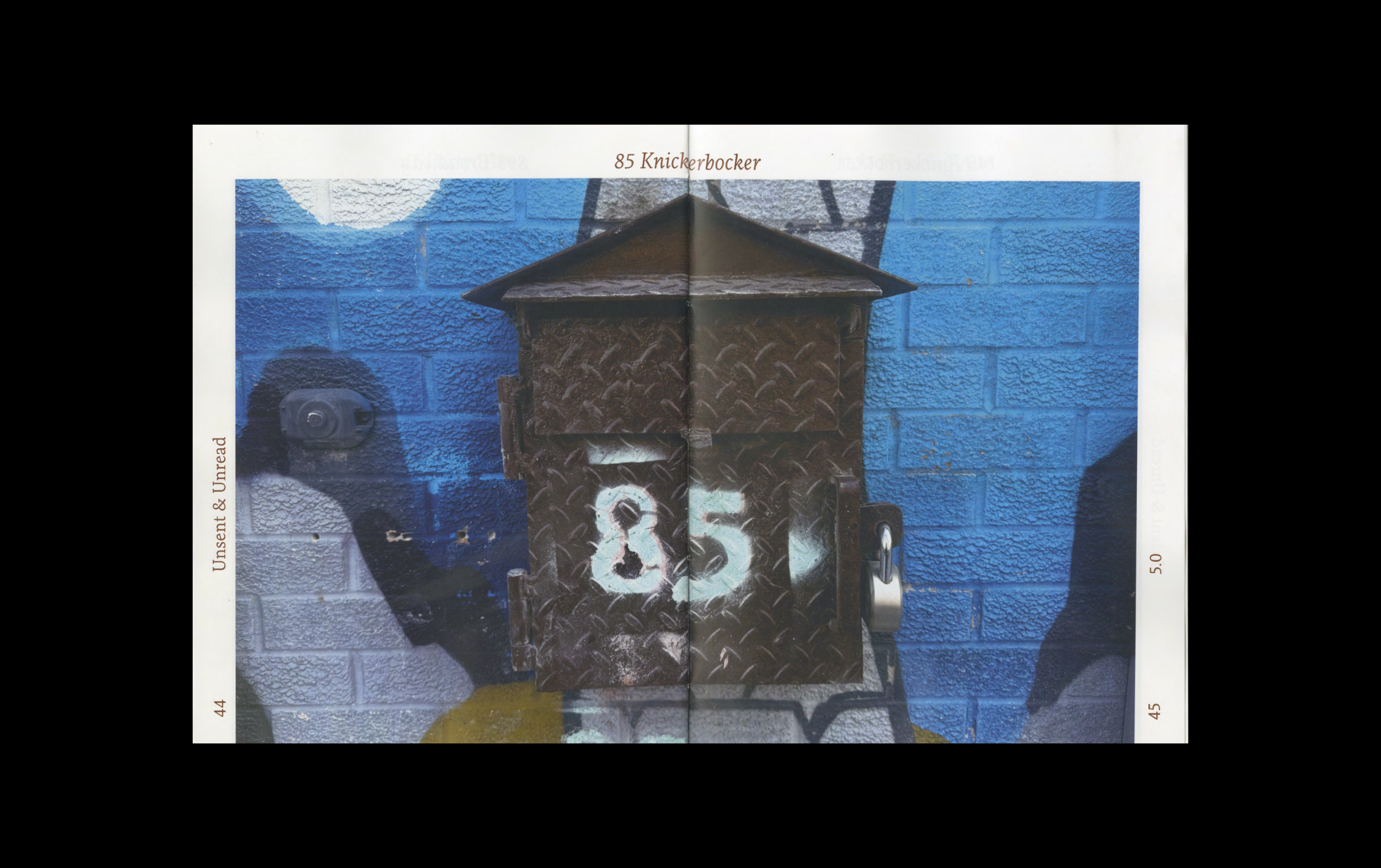
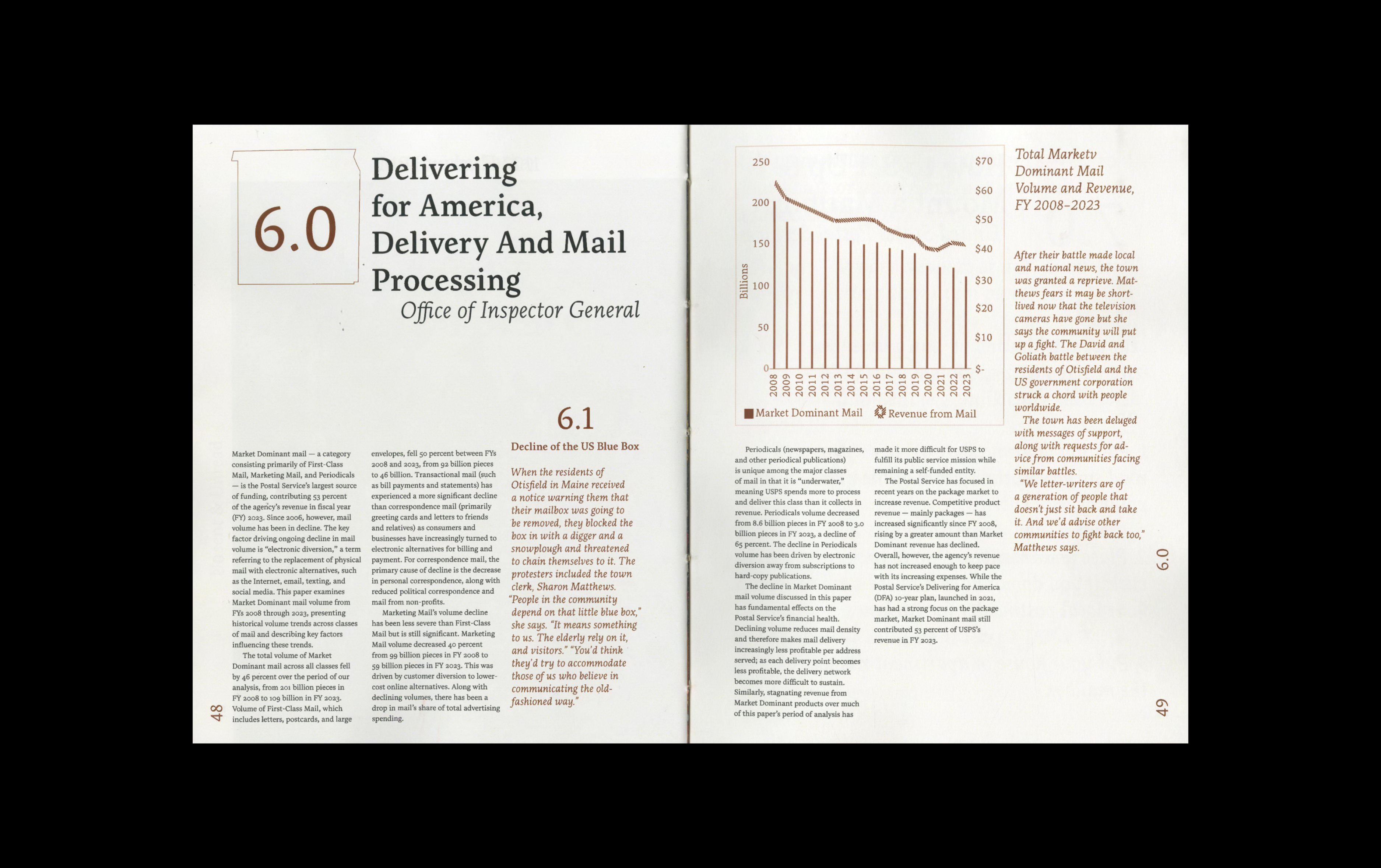
Unsent & Unread, 2025
Book Design, Photography
A book dedicated to reintroducing the mailbox. Featuring a range of texts and visuals that explore the concept of communication in the digital age.
→
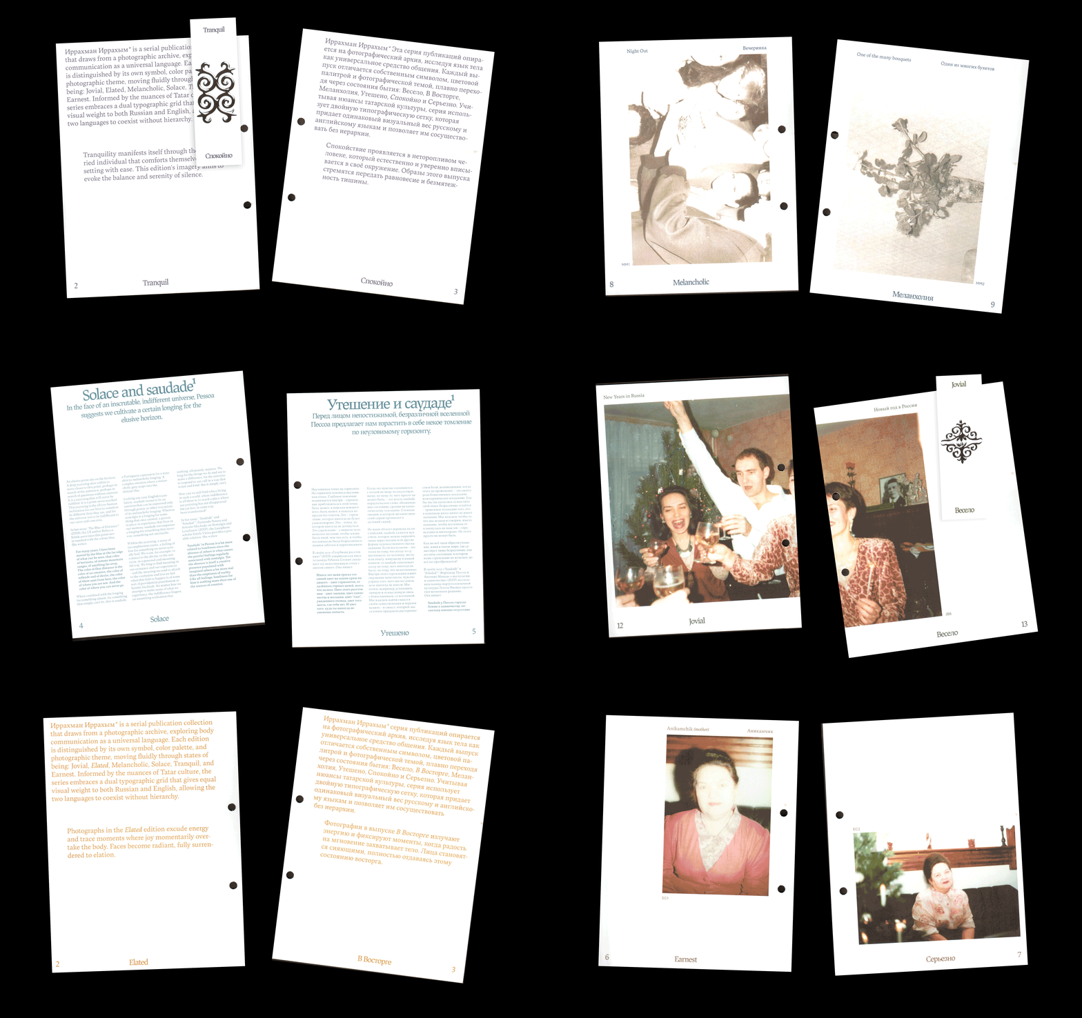
Digitising a Photographic Archive, 2025
Book Design
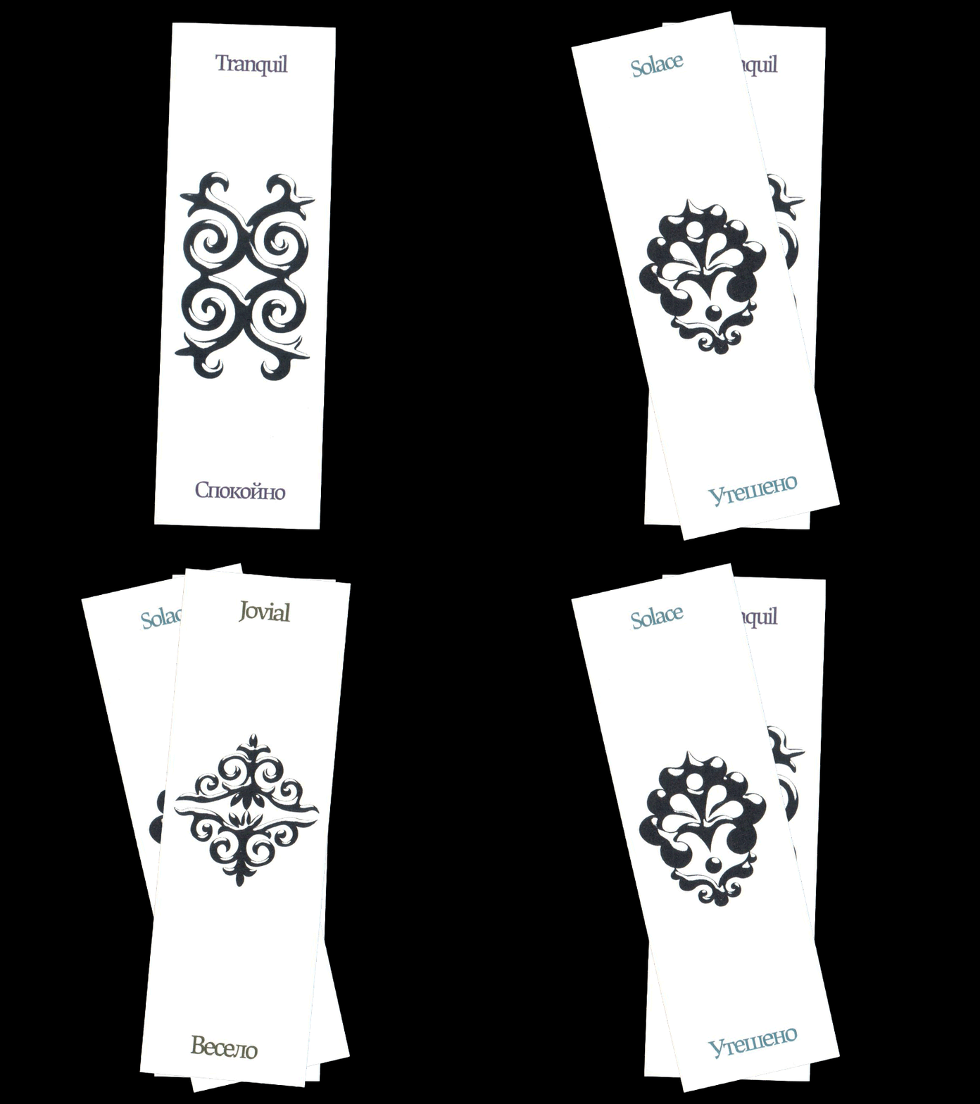
Иррахман Иррахым* is a serial publication collection that draws from a photographic archive, exploring body communication as a universal language. Each edition is distinguished by its own symbol, color palette, and photographic theme, moving fluidly through states of being: Jovial, Elated, Melancholic, Solace, Tranquil, and Earnest. Informed by the nuances of Tatar culture, the series embraces a dual typographic grid that gives equal visual weight to both Russian and English, allowing the two languages to coexist without hierarchy.